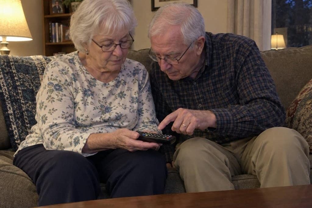
You reach for the TV remote in the evening. You press what you’re almost certain is the volume button — and suddenly you’re three menus deep into something you didn’t mean to open.
You hold the remote closer. Then farther.
You tilt it toward the lamp. The buttons all look the same. The labels seem to have just… disappeared.
It’s a small thing. But it happens every night. And the quiet frustration of not understanding why makes it worse.
Here’s the thing: most people in this situation don’t think of themselves as having a vision problem. Their last eye exam came back fine. So what’s actually going on?
There’s a specific explanation — one that most people have never heard of — and once you understand it, a lot of things start to make sense. Not just the remote. The keyboard, the microwave panel, the washer display. All of it. Let me walk you through what contrast sensitivity is, why it changes before most people notice anything else, and what to look for so that everyday devices stop being a daily source of frustration.
Contrast-Friendly Device Cheat Sheet
Download this practical cheat sheet to stop struggling with remotes, keyboards, and appliances—and learn exactly what to look for when buying new devices so poor contrast never catches you off guard again.
Your Vision Test Came Back Fine — So Why Can’t You Read Your Remote?
Acuity and Contrast Are Two Different Things
When your eye doctor checks your vision, they’re measuring visual acuity — how clearly and sharply you can distinguish letters at a set distance. That’s the 20/20 number. It’s a useful measurement, but it only tells part of the story.
Contrast sensitivity is something different. It’s your visual system’s ability to distinguish between shades that are close in value — a dark grey label on a dark grey background, for example, or light grey text on a white surface. You can have excellent acuity and still struggle significantly with low-contrast situations.
Why Standard Eye Exams Often Miss This
The standard eye chart — black letters on a bright white background — is about as high-contrast as anything gets. It’s specifically designed to test acuity, not contrast sensitivity. So you can pass it with flying colors and still walk out of the office struggling to read the grey-on-black buttons on your TV remote in a dimly lit room.
Contrast sensitivity often begins to shift in your 60s and 70s — sometimes well before anyone would describe themselves as having a vision problem. It’s not imaginary. It’s not the lighting. It’s a specific, measurable visual change that the standard exam simply isn’t designed to catch.
The Real-World Illustration
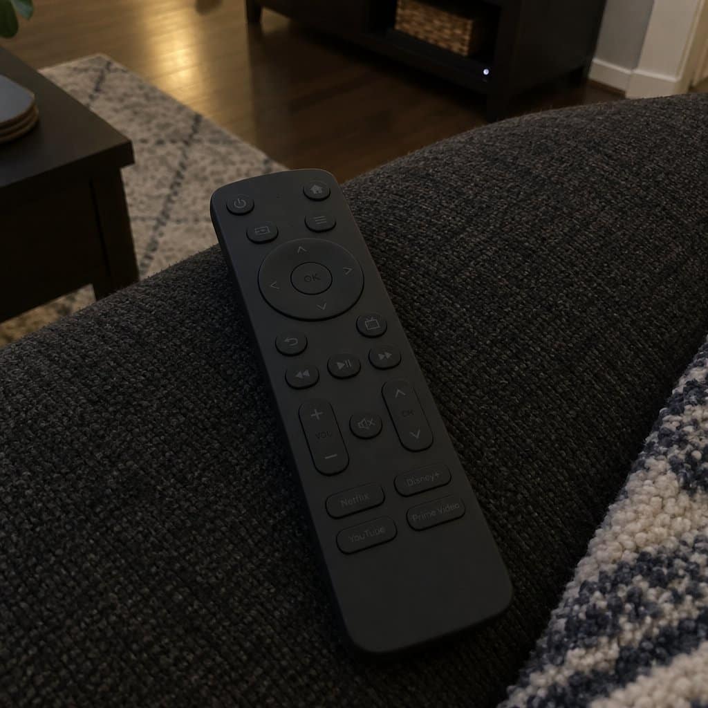
Think about reading a book with crisp black text on a white page — even with minor vision changes, that’s usually manageable. Now picture the buttons on a typical TV remote: dark grey housing, slightly darker grey labels, used in a dim living room in the evening. Both situations technically require the same visual acuity. But one is genuinely readable and the other has become nearly impossible.
That’s contrast sensitivity at work. And understanding it shifts the question from “what’s wrong with me?” to “what should I be looking for in the products I use?”
The Devices Most Likely to Stop Working First


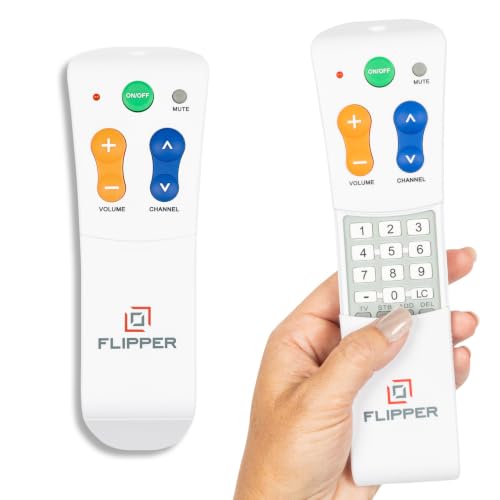
TV Remotes Are the Most Common Offender
Small buttons. Dark housing. Dark print. Used at arm’s length in low-light conditions in the evening — which is exactly when contrast sensitivity decline is most pronounced. TV remotes are practically engineered to become frustrating for aging eyes, even though that’s obviously not the intent.
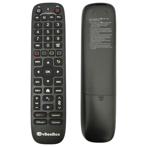
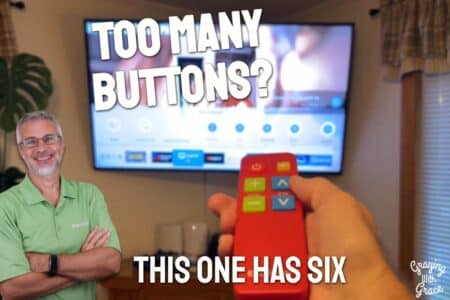
When contrast sensitivity is the issue, a large button remote control designed with high-contrast labeling and a simplified layout works with your vision rather than against it. Larger print alone isn’t enough — it’s the contrast between the label color and the button surface that makes the real difference.


Keyboards and Computer Peripherals
Many modern keyboards favor a sleek, minimalist look — which usually means grey legends on silver keys, or dark legends on dark keys. That aesthetic decision hits aging eyes hard. The right keyboard for older adults prioritizes legibility over style, with sharp color contrast between the key legends and the key surface itself.
Appliance Panels and Household Devices
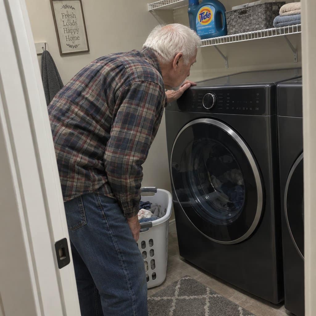
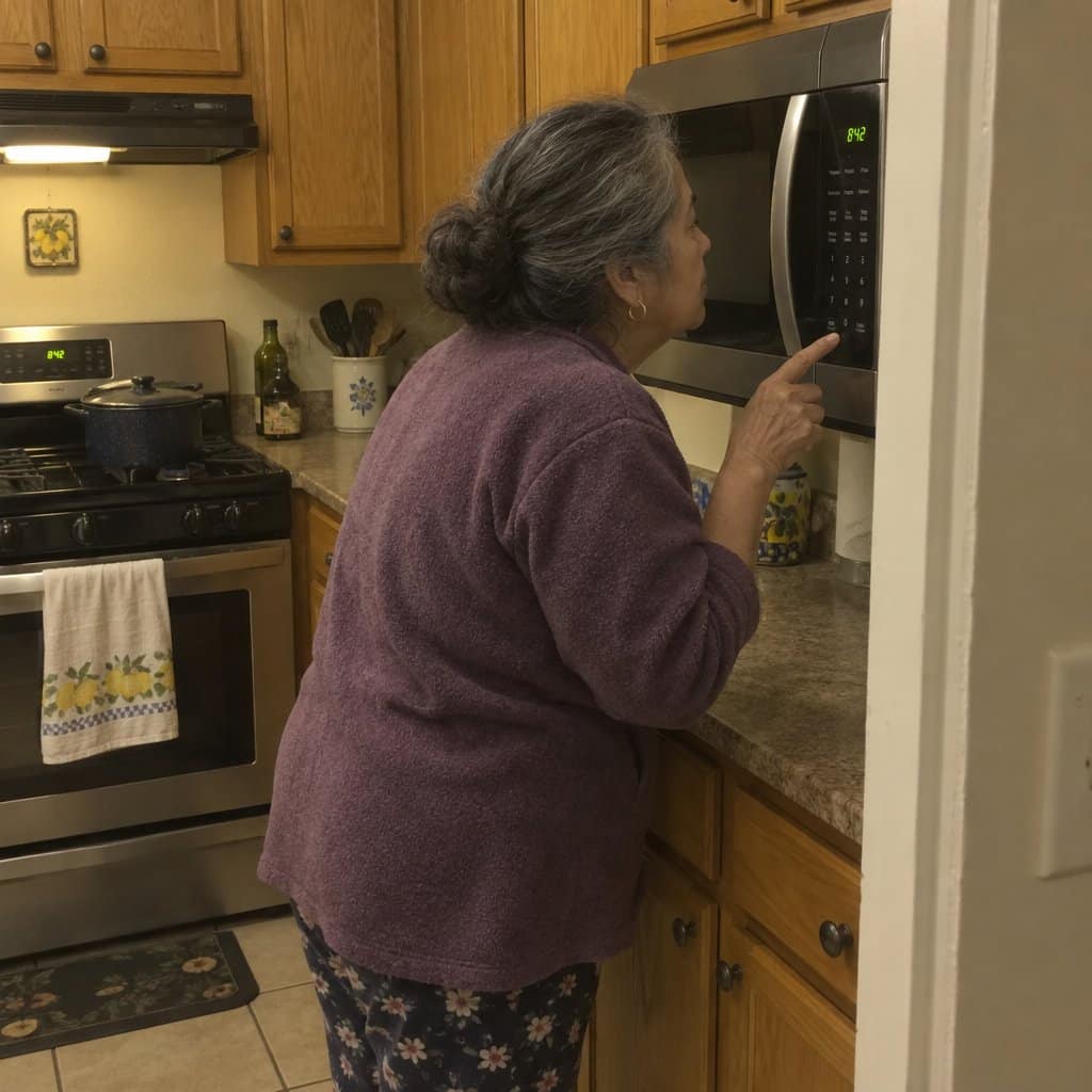
Microwave buttons. Washer and dryer controls. Flat-panel displays on kitchen appliances. These have followed the same design trend toward low-contrast, flush surfaces that look clean but become genuinely difficult to navigate when contrast sensitivity has shifted.
The Compounding Effect of Low Light
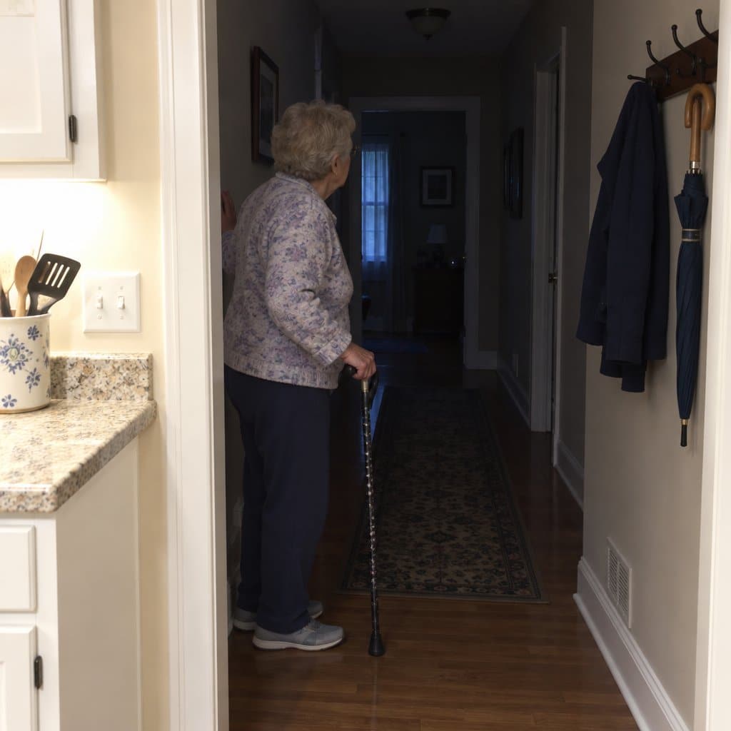
Contrast sensitivity decline is most noticeable in dim or changing light — transitional spaces, evenings, rooms lit by a single lamp rather than overhead lighting. This is also when most people watch TV, cook dinner, and handle medications. The timing is unfortunate, and it’s worth knowing that better lighting choices throughout the home can meaningfully reduce the daily burden.
Your eyes aren’t failing. The design is. That distinction matters — because it means the solution is often a better device, not a medical appointment.
What Contrast Sensitivity Decline Actually Feels Like Day-to-Day
It Shows Up in Specific Moments, Not Everywhere at Once
This isn’t about missing small details or struggling with fine print. Contrast sensitivity decline shows up in very particular situations — and because it’s so specific, people often misattribute it to something else entirely.
Here’s what it actually looks like in daily life:
- You read books and newspapers without much difficulty, but certain screens or devices are genuinely hard to make out
- Things are harder to see in the evening than they are in the morning
- Bright light helps in a way it didn’t used to — you find yourself tilting the remote toward a lamp
- Appliance labels in a dimly lit kitchen are harder to read than the same labels in daylight
- Transitional lighting — like moving from a bright room into a hallway — takes more adjustment than it used to
The Cognitive Load Is Real
When your visual system is working harder to distinguish low-contrast content, it adds up. Squinting, re-reading, second-guessing which button you pressed — these micro-efforts accumulate into genuine fatigue. It can even feel like mental slowdown, when what’s actually happening is that your brain is spending extra resources on a visual task that used to be automatic.
Naming that experience is the first step toward fixing it. When squinting at a remote starts feeling exhausting, that’s not an exaggeration. Your visual system is doing extra work that it shouldn’t have to.
Subscribe to our newsletter for more tips: Join here
A Lighted Magnifier Bridges the Gap When You Can’t Replace the Device
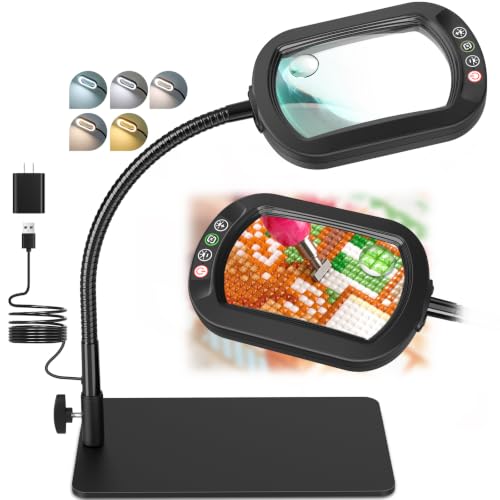
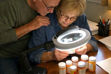
Sometimes you can’t swap out the appliance or the device — and for those situations, a lighted magnifier is one of the most practical tools available. It addresses both sides of the contrast sensitivity problem at once: it enlarges the label or text, and it adds direct light to the surface you’re trying to read, which dramatically improves the contrast your eyes can actually work with.




What to Look for When Shopping for Devices That Actually Work
Contrast Ratio Is the Most Important Factor — Not Size
Here’s the insight that changes how you shop: a large button with grey-on-black printing is still harder to read than a smaller button with sharp black-on-white contrast. Size gets all the attention, but contrast is what actually determines readability for aging eyes.
When evaluating any device — in a store or from a product photo — try this: squint slightly and see if the labels disappear. If they do, the contrast isn’t sufficient. If they remain clearly visible even when squinting, you’ve found something worth considering.
What Good Contrast Looks Like in Practice
You’re looking for one of two configurations:
- Dark text on a light background — black or dark navy on white or cream
- Light text on a dark background — white or yellow legends on black keys or buttons
What you’re avoiding is grey on grey, dark grey on black, or any combination where the label color and the background color are close in value. These are the combinations that become genuinely unreadable when contrast sensitivity has shifted — even if they look fine in bright store lighting.
Backlighting Solves the Evening Problem
For devices used in variable lighting — especially in the evening — backlighting changes everything. A backlit remote control makes the buttons visible regardless of how dim the room is, so you’re no longer tilting the remote toward the nearest lamp just to see what you’re pressing.



The Same Principle Applies to Your Computer Setup
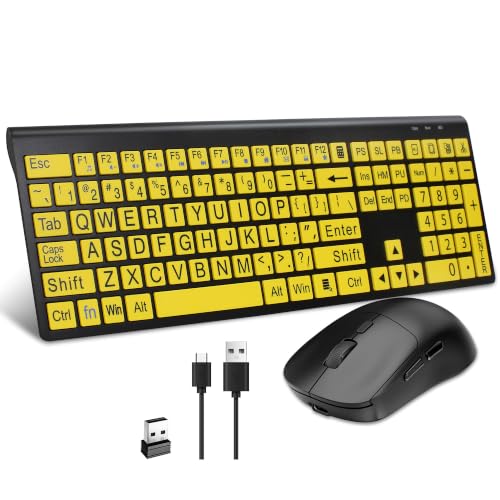
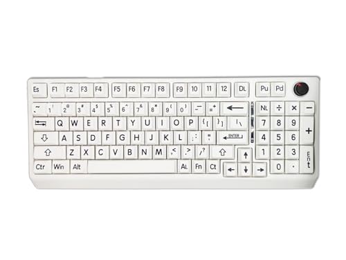
If you find that your keyboard has become harder to read — especially in lower-light situations — a high contrast keyboard applies the same logic that makes a good remote easier to use. White or yellow legends on black keys, or vice versa, rather than the grey-on-silver or dark-on-dark designs that dominate standard models. If you’re currently navigating whether a laptop or tablet suits your needs better, contrast of the keyboard or on-screen keyboard is worth factoring into that decision too.




When to Ask for a Contrast Sensitivity Test — and What It Tells You
It’s a Different Test Than What You’ve Been Getting
Contrast sensitivity testing exists as a distinct evaluation from standard acuity testing — but you usually have to ask for it specifically. At your next eye appointment, you can simply mention that you’ve been noticing more difficulty reading low-contrast displays and labels, especially in the evening, and ask whether contrast sensitivity testing would be worth adding.
The results aren’t a diagnosis. They’re data. They give you a clearer picture of what types of visual environments you’re actually working in, so you can make smarter decisions about lighting, device selection, and home setup.
This Is a Proactive Step, Not an Admission of a Problem
Getting a contrast sensitivity test isn’t raising a red flag — it’s gathering information that helps you make better choices. Think of it the same way you’d think about getting your blood pressure checked: useful data that helps you understand your environment and act accordingly.
It connects naturally to other areas of home setup too. Contrast sensitivity affects more than just devices — it plays a real role in fall prevention, since steps, thresholds, and transitional spaces become harder to read in low-contrast or low-light conditions. Knowing your baseline helps across the board.
A Quality Magnifying Glass Remains One of the Most Practical Everyday Tools
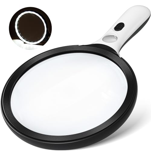
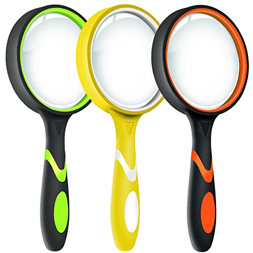
For the moments when device replacement isn’t an option — reading medicine labels, instruction manuals, or product packaging with low-contrast printing — a quality handheld magnifying glass with good lens clarity is still one of the most reliably useful things to have within reach. It doesn’t require charging, it doesn’t need setup, and it works everywhere.



Contrast-Friendly Device Cheat Sheet
Download this practical cheat sheet to stop struggling with remotes, keyboards, and appliances—and learn exactly what to look for when buying new devices so poor contrast never catches you off guard again.
You Don’t Have to Keep Squinting



Contrast sensitivity is one of the least-discussed vision changes that comes with aging — but it’s one of the most practically significant. It explains why certain devices become difficult to use long before anyone would describe themselves as having a vision problem. And because it’s specific, it points toward specific solutions.
You don’t have to keep working harder than you should to navigate the devices in your own home. Understanding what’s happening puts you back in control. Shopping with contrast in mind — for remotes, keyboards, and other daily-use devices — is one of the most practical changes you can make to keep life running smoothly. And if you want to explore other simple TV remote options designed specifically with older adults in mind, that’s a great place to start.
Think about one device in your home that’s become genuinely frustrating to use. Could contrast be the culprit? I’d love to hear about it in the comments — your experience might help someone else recognize the exact same pattern they’ve been quietly dealing with for months.


![Older woman cane glasses chain kitchen safety[1]](https://www.grayingwithgrace.com/wp-content/uploads/2026/05/older_woman_cane_glasses_chain_kitchen_safety1-e1778601056307-450x300.jpg)